Branding and Logo

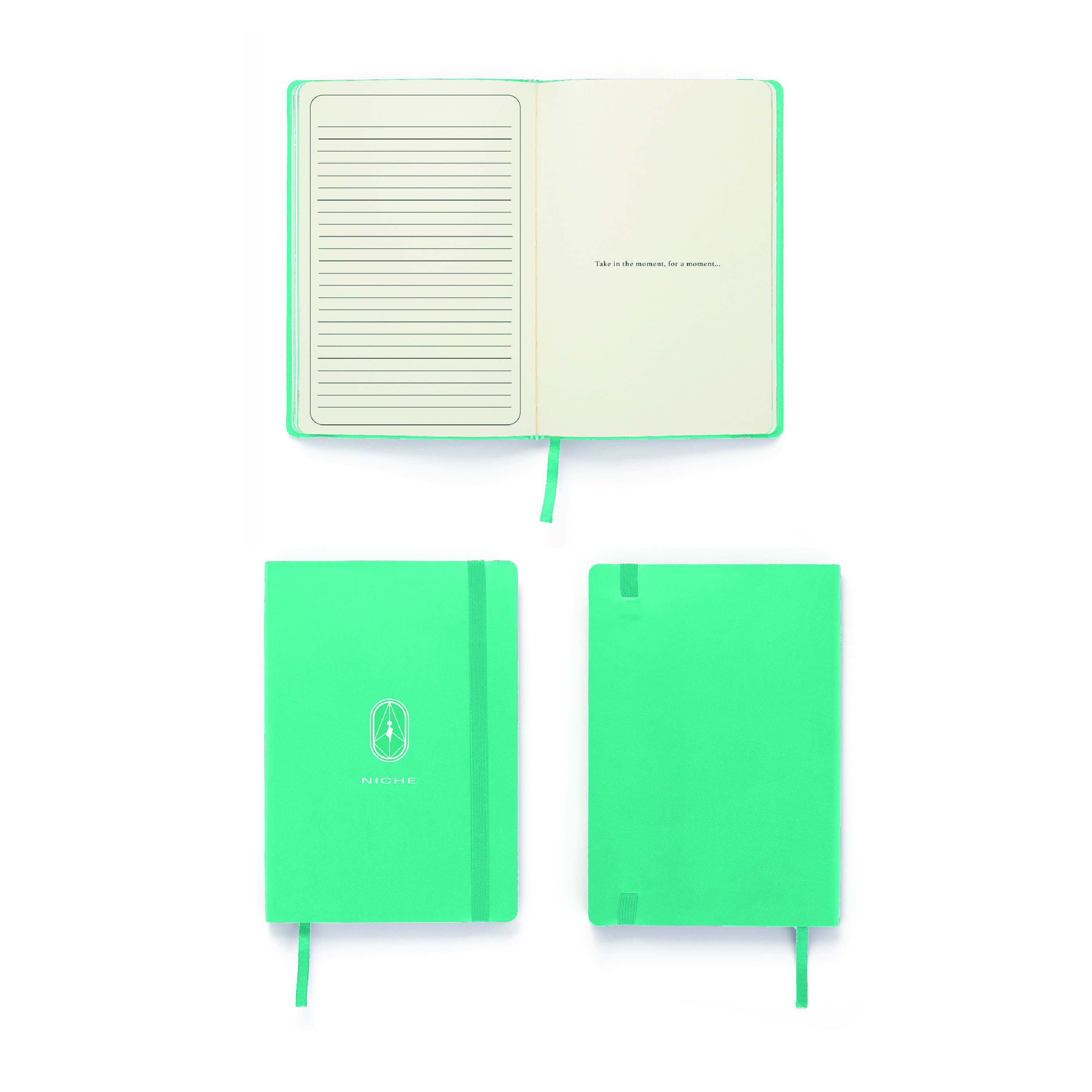
Niche was a branding exercise developed during my undergraduate studies at Boston University, conceptualized as a digital wellness brand. The project explores the idea of “niches” as literal corners of physical spaces, using liminality as a framework to transform environments into mental states. Through its brand architecture, Niche recontextualizes wellness branding as an experience that exists between space and mind.
The project began as an exploration of in-between spaces, areas that exist between two defined environments. Examples ranged from the gap between an open door and the wall it meets to the side of a car seat where objects slip out of reach. I chose to focus on the corners of rooms, particularly in crowded environments, and used this as the foundation for building a brand system. The assignment required developing a full identity with intentional use of color, typography, and design, resulting in a cohesive and structured framework.
I was drawn to corners based on a moment on my way home from class. I entered an elevator with five other students, and in an unspoken attempt to create personal space, everyone instinctively moved into separate corners. That moment made me think about how we construct privacy through positioning and how we carve out space for ourselves within shared environments.
Even when surrounded by others, this spatial positioning becomes psychological. You feel a sense of comfort knowing you have your own place, a niche to exist within. This led me to think about mindfulness and meditation, and how we use physical space and bodily awareness to achieve mental clarity and emotional grounding.
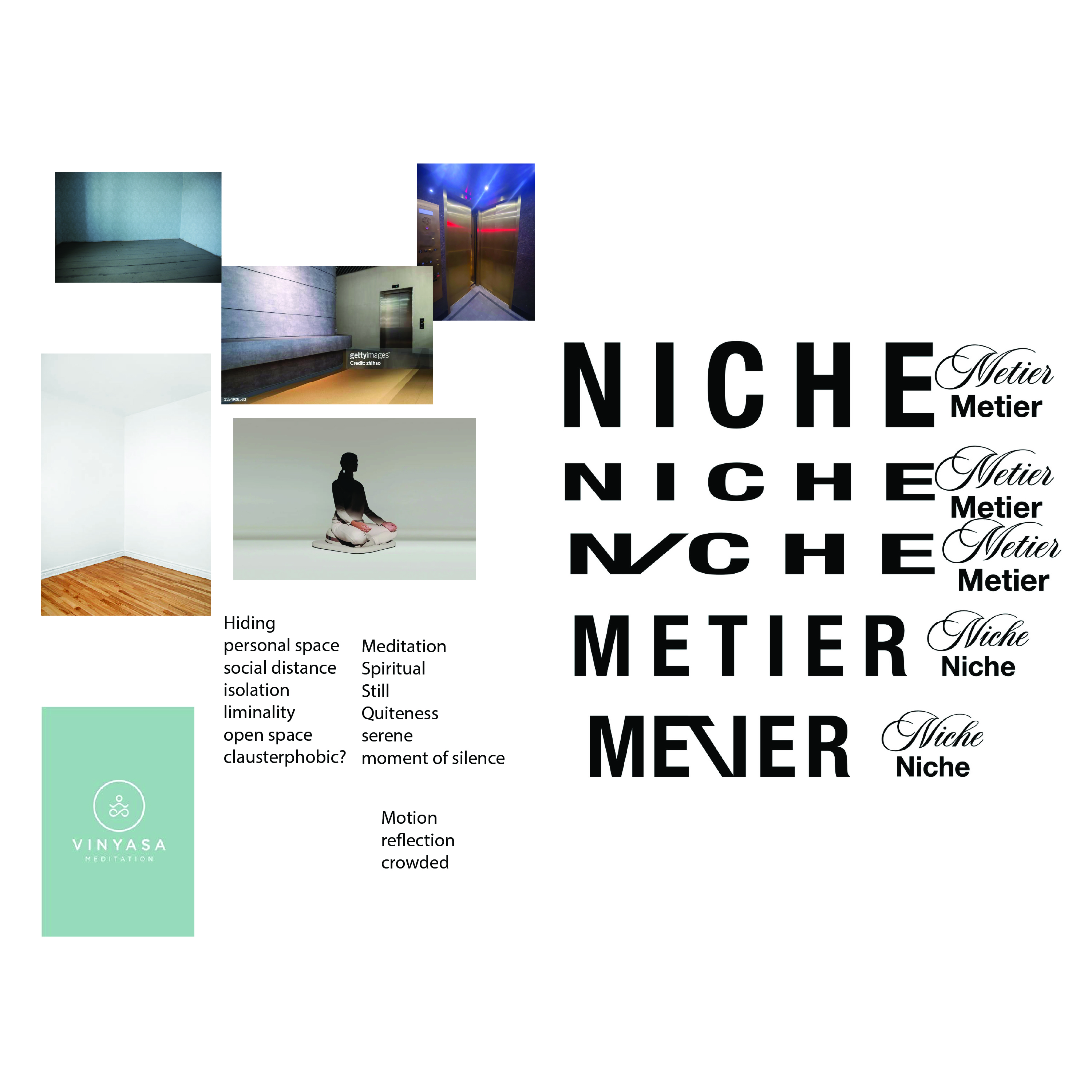
insert text

insert text
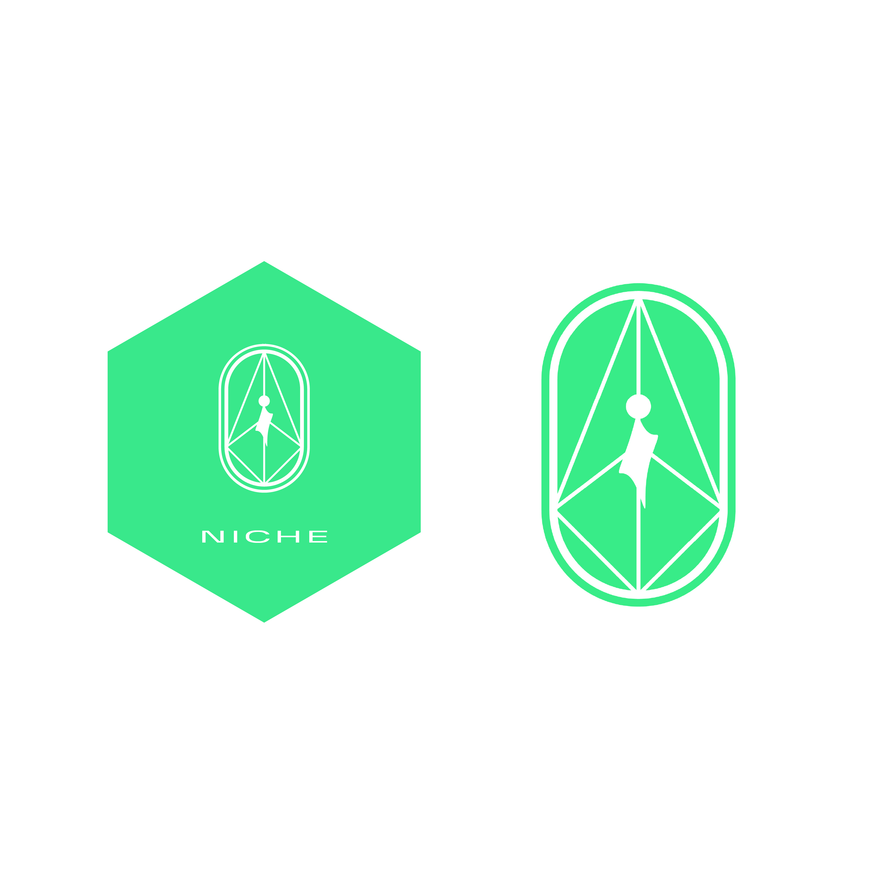
insert text
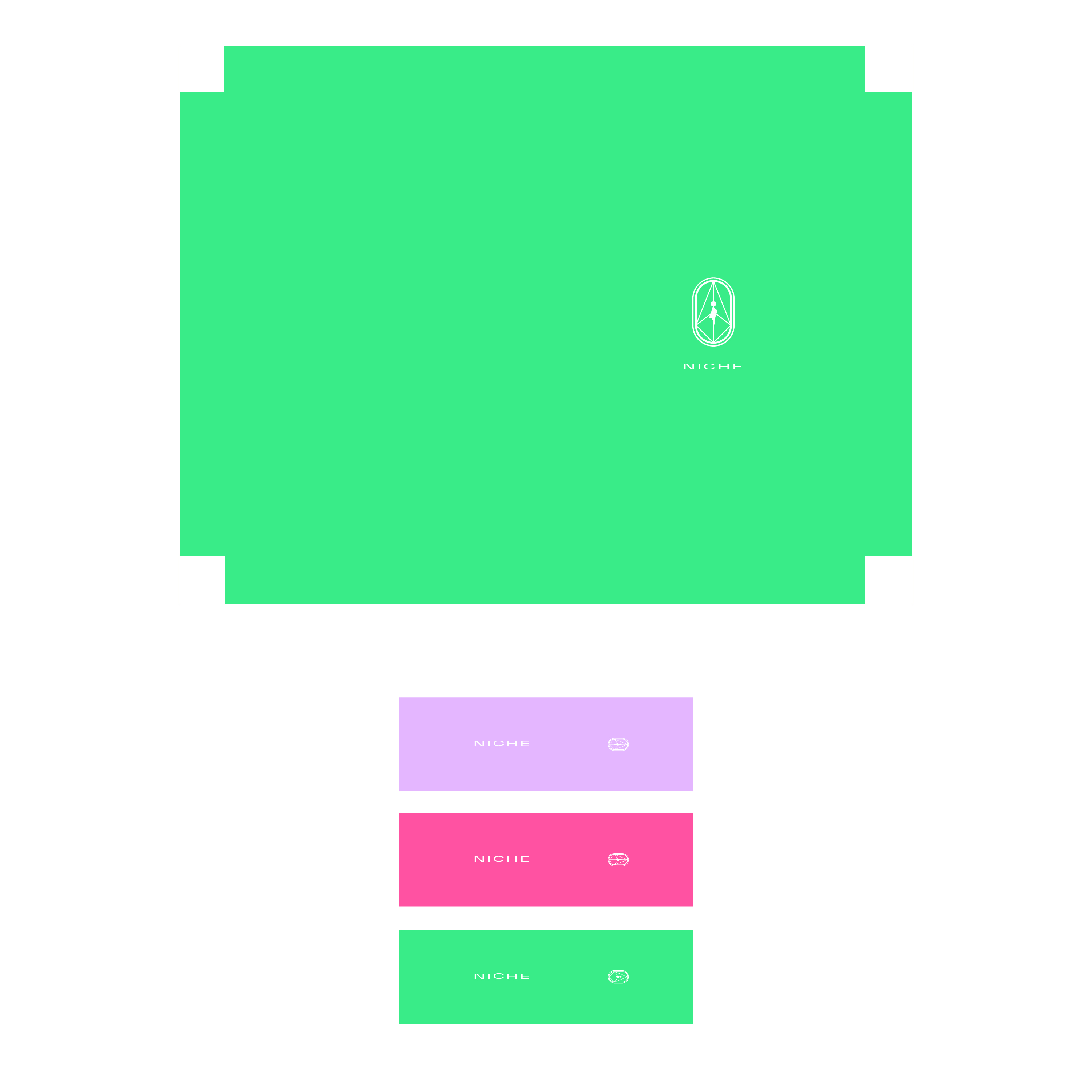
insert text
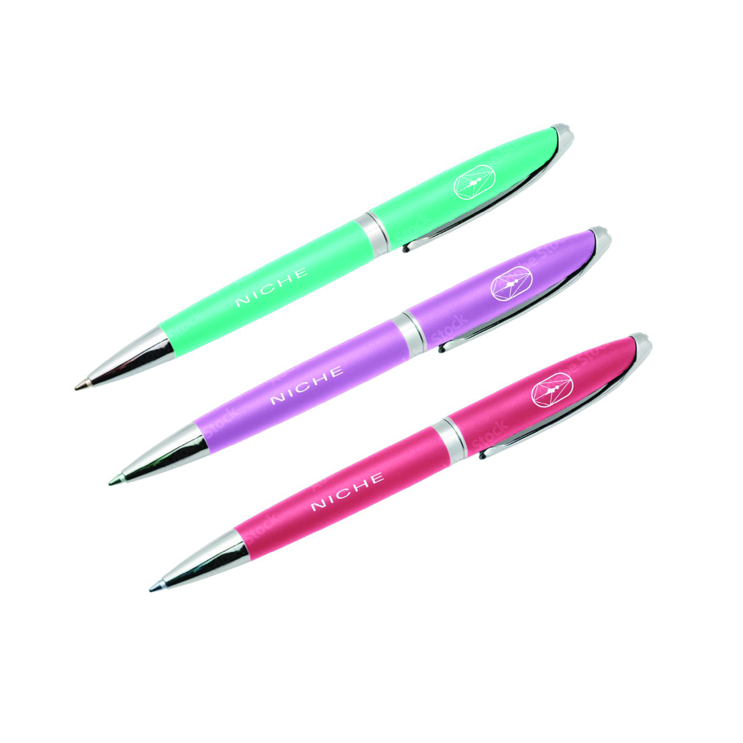
insert text
insert text

insert text

Wealth Tea is a small financial literacy company based in Washington DC, and was a client project from 2024. I was tasked to design a logo and wordmark for merchandising. The services are targeted to young people, POC, LGBTQ+, and generally the communities that statistically lack financial literacy and economic knowledge.
The concept of “tea” refers to having a conversation over a cup of tea, encouraging a safe and honest environment to educate people on their money.
The evolution of the logo shows how all the elements and symbolism were condensed and abstracted into a simple, scalable, and readable as a financial literacy company.

insert text

insert text

insert text

insert text

insert text

insert text
insert text

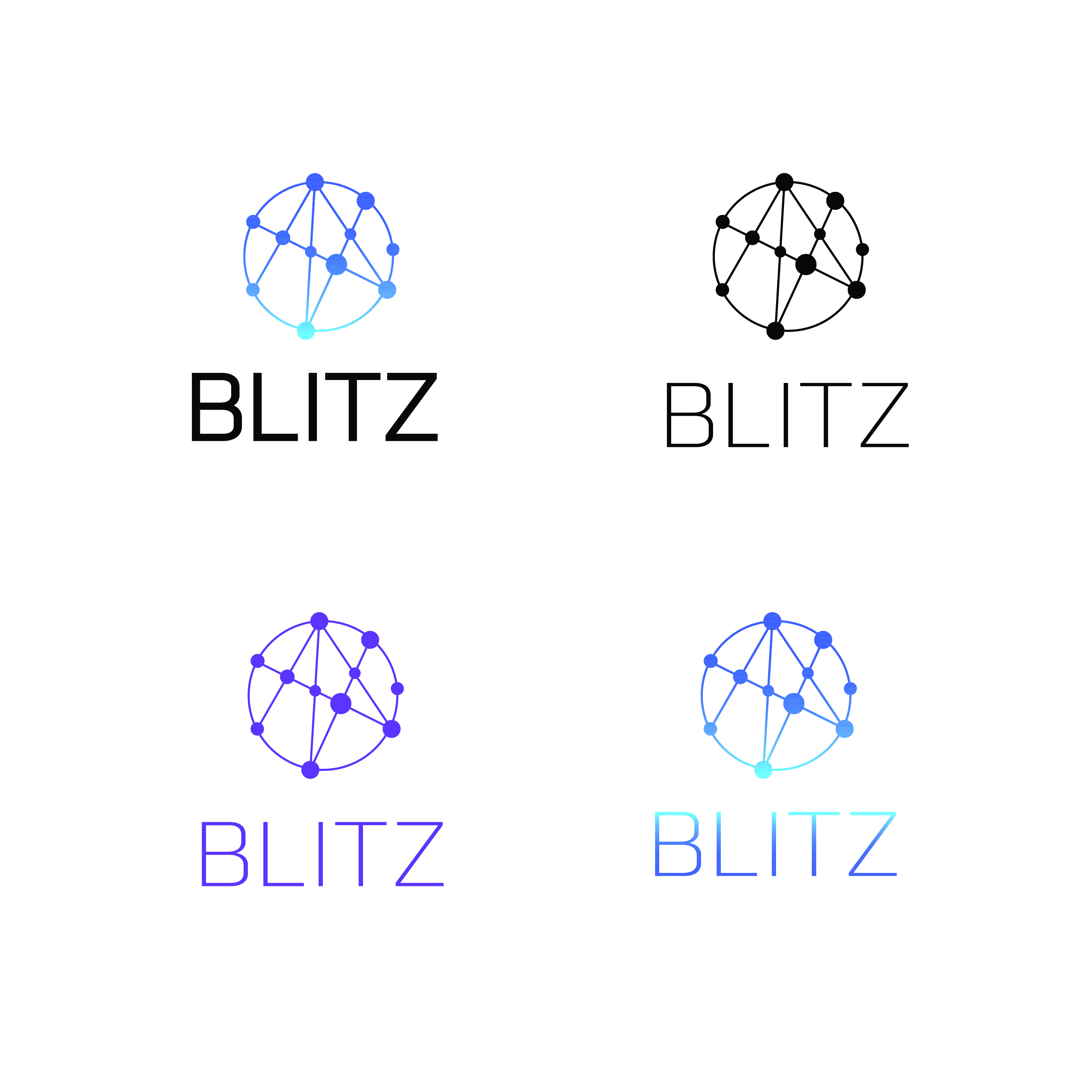
Blitz was a client project from a student-peer during undergrad. He was developing an app to help college students network around classes, clubs, hobbies. The goal was to encourage social interactions and community building as students would be able to coordinate study times, lend class materials, and updates on campus news. It would borrow elements from Reddit, Tik-Tok, and LinkedIn.
He wanted a logo and watermark that emphasized networking with a modern technological spin. I developed a myriad of sketches and developed the forms that we believed captured the essence of the visual identity.

insert text

insert text

insert text

insert text
insert text
insert text